Video conferencing is the new office / living room / dinner table / doctors office…
As the spaces of our social lives have transitioned to a limited number of software interfaces, fatigue and burnout has skyrocketed taxing our mental health and productivity. While video conferencing apps are keeping us employed and connected, they are not prepared to handle this mass shift in our daily routines and social interactions.
What makes video conferencing so different?
When we spend our days sitting in our makeshift offices and personal spaces staring at our coworkers, friends, doctors, teachers and families (and don’t forget ourselves!) in little boxes on our screens we miss so much of the social experience of real face to face interactions. We’re unable to read body language, engage in normal social rituals, have serendipitous conversations—to move!
We’re also responding to a unending amount of new information that our brains need to process—our personal lives surrounding us at home, the apartments and houses of our coworkers and their personal lives happening around them, the host of distractions on our desktops and the lure of almost unnoticeable multitasking.
Can the design of our meeting software help?
As a UX designer working to build a video conferencing platform, it’s been crucial to acknowledge the limitations of the medium in hopes of easing some of the fatigue with features designed not to replicate in person communication but to uncover and build on the strengths of a relatively new space.
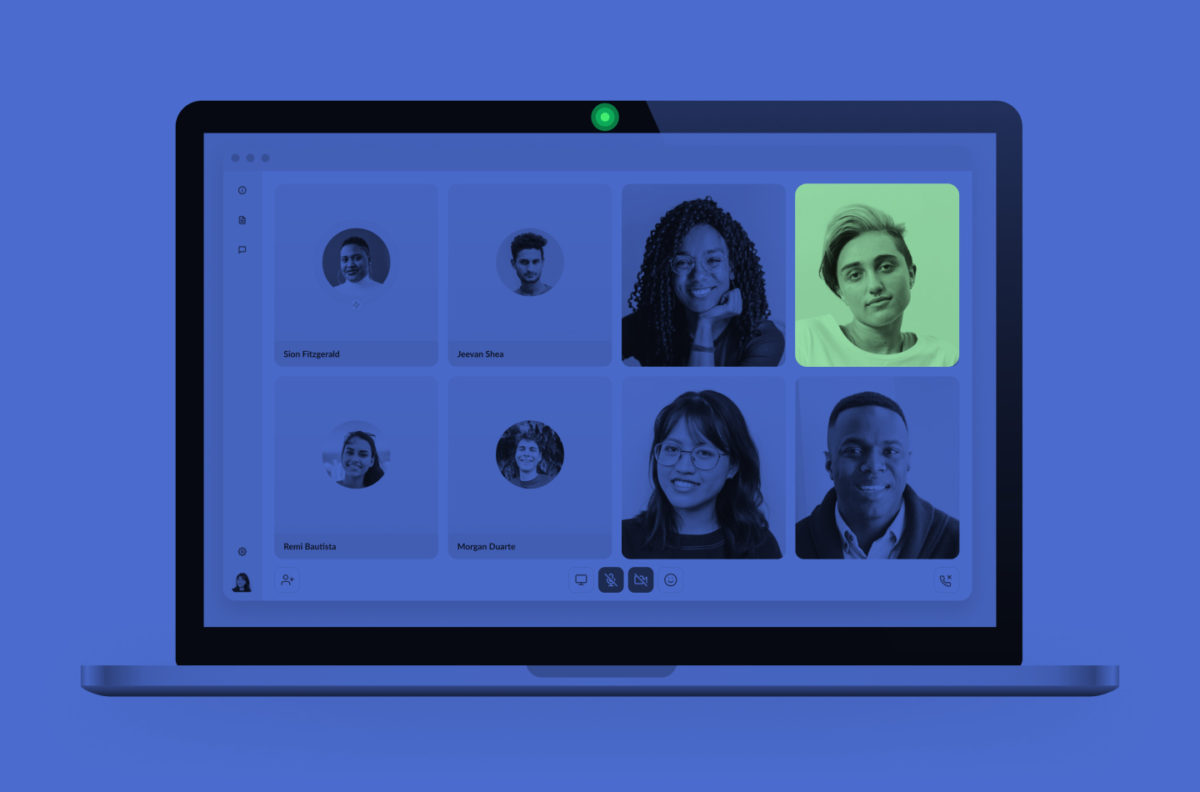
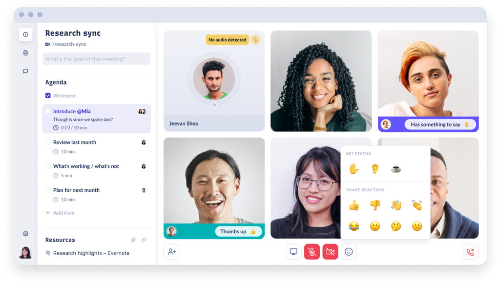
Improving our new space – The meeting room
We spend so much care and effort creating the physical spaces we occupy, and these spaces have a known effect on our mental health as well as our productivity, creativity and sociablility. A black box filled with poor quality images littered with icons can feel like spending all day in a messy room with no windows—of course we’re exhausted after a day of video meetings! But what can we do to make these new rooms feel like sleek, light filled rooms with all the personal touches that we invest so much thought into?
The furniture, if you will, of these new spaces is entirely different. Instead of tables, whiteboards and light switches we have new furniture that has to replicate everything else missing from in person interaction—all those icons littered about. Unmute is the desk of a virtual meeting room.
Designing meetings rooms for Frameable has strived to take into account interior design principles as well as UX best practices. Does a glaring red mute icon create more stress and visual clutter than it provides important functional information? Our process has been one of many iterations, focusing on light colors, subtle gradients and subdued accents.
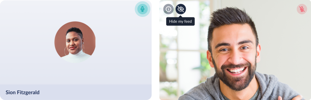
Camera on or off?
We’ve never been more aware of the green light at the top of our screens. In almost daily research sessions over the past few months I’ve yet to encounter a team that has found the golden solution to the camera on or off question.
Companies that had a camera on policy have switched to camera optional and those with a camera optional approach have switched to camera on. Some teams use cameras only for smaller meetings or only require those speaking to use video.
Camera off can feel less personal but also removes the need to process so many different faces and backgrounds at once. While being on camera for the majority of a day is incredibly exhausting and not always necessary for productive work meetings.
- There is probably no golden solution, but some design attention can greatly improve both sides of the coin.
- A more aesthetically pleasing camera off view that still includes the face of a coworker and a signal when/that they are speaking.
- Flexible layouts for different scenarios—one speaker, a handful of speakers, screenshare brainstorm etc.
- The option to hide or minimize your own video.
- Blurred or custom backgrounds for camera on mode—which can be a lot of fun and also a potential new distraction.
Social interactions are audio/visual only
Undoubtedly the most difficult aspect of video communication is the lack of body language and other non verbal cues. In video meetings we only have our facial expressions and voice to communicate that we are engaged and participating—whereas in person we are able to show our attention by turning our bodies to face the speaker, making eye contact, nodding etc. Likewise a speaker can gauge attention and check to see if someone has an interjection by scanning the room. These instinctual social tools are much less effective when all we see is the face of a teammate.
On top of that poor sound quality and spotty connection can cause anxiety around natural pauses in conversation. We worry that our technology is failing us rather than allowing those valuable moments of thought and reflection.
So what can design do to ease the pain?
- Allow participants to respond to a speaker without have to unmute and interrupt with non verbal reactions
- Hand raising features to let a facilitator know when someone has something to say
- Collaborative and flexible agendas with assigned speakers to let everyone know when it’s their turn to talk
- Show when a participant is experiencing connectivity issues and visibly show when they have entered bandwidth saver mode
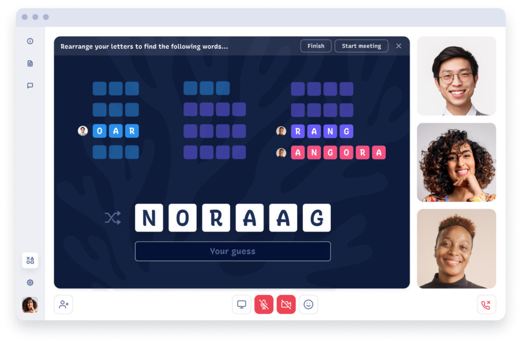
Meetings start VERY abruptly
All of a sudden you’re face to face with an unfamiliar coworker, from your bedroom…and the person who called the meeting is running late. This scenario is unique to telecommuting. Maybe you regularly walk to the conference room with a coworker, or you introduce yourself politely and take the first few minutes of a meeting to fill your water bottle while everyone else arrives.
All of this is much more awkward over video. Small talk is less natural with mute/unmute issues, lack of non verbal cues and often bandwidth time delays. Widespread goals to keep meetings efficient encourage us to get straight to the point, which can be jarring.
How can UX help those first few meeting minutes?
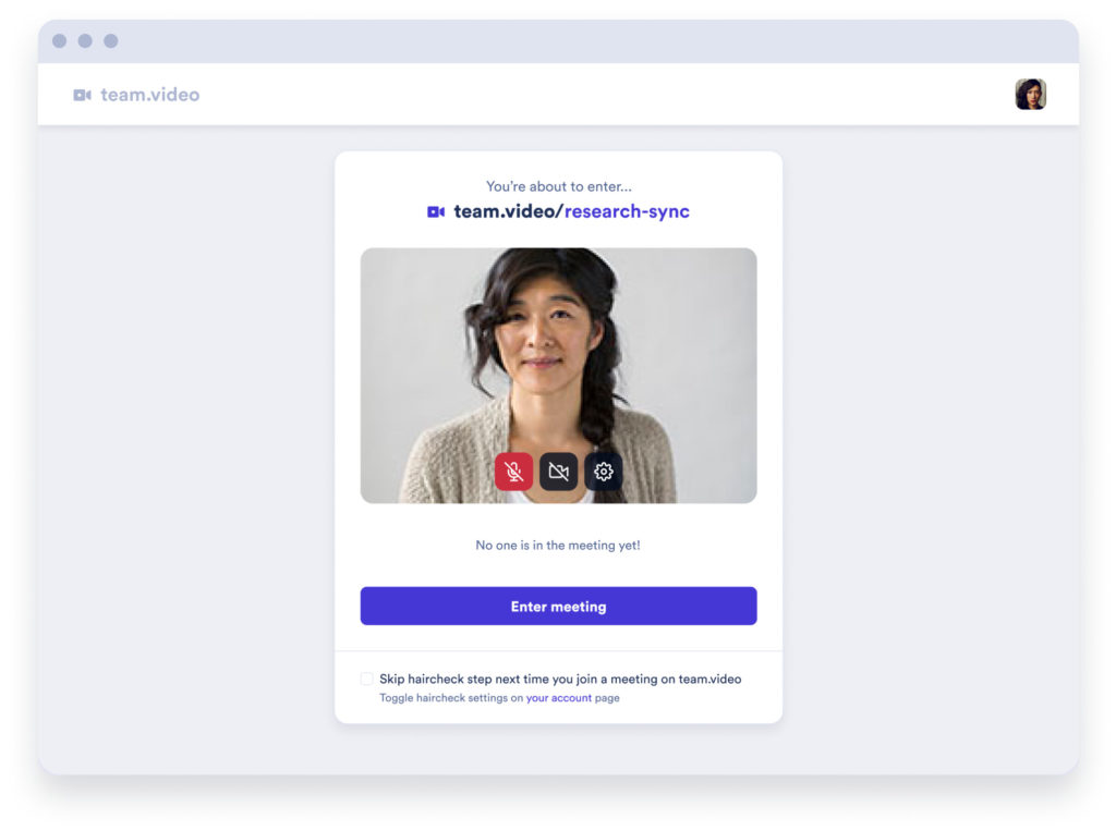
- It’s important to know who is already in the meeting before you join so you can decide if you want to be one on one with a C level you’ve never met.
- Arrive looking (and sounding!) your best with a pre-meeting ‘haircheck’ where meeting goers can check their audio/video before entering the meeting
- Low effort social interaction built in to the welcome minutes. At Frameable we’ve implemented an optional word game that early arrivers can play against each other in lieu of or in addition to any amount of small talk.
Keep trying new things!
Design is always about observing, trying and testing. With Frameable we’ve been able to explore some ideas larger companies have not and we’d love to hear any thoughts or issues that you’ve encountered in our software or others!
Try us out and book a demo here.